Understanding embellishment in infographics
Everyone has seen it: Infographics (charts, graphs, diagrams) which are decorated, sometimes, possibly, too much. On the one hand, it can be argued that such decorations are harmful, as they do not contribute anything to showing the data underlying the chart. On the other hand, as with any communication tool, decoration is not there for nothing - it can help audiences engage with the message behind the data.
How do we know how to choose the right amount of decoration?
Study
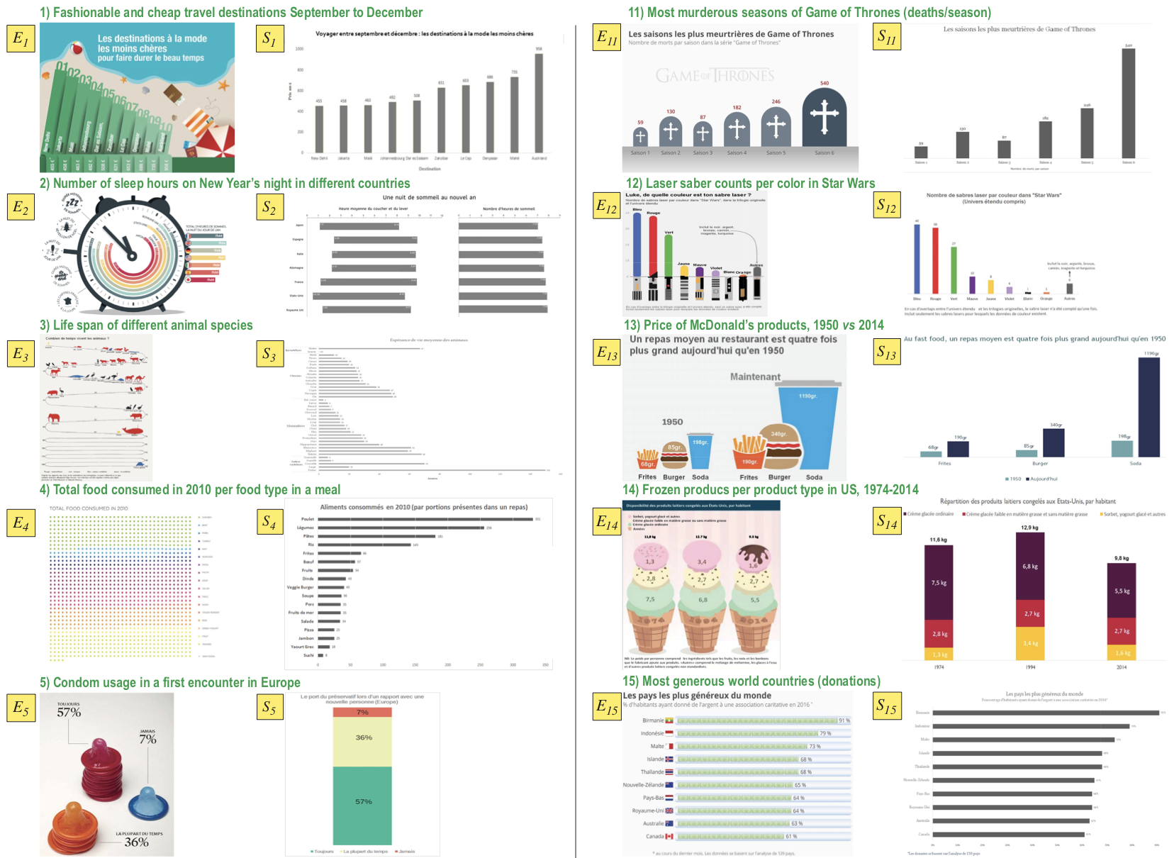
To answer this question, we undertook a detailed study. We selected 20 decorated infographics and created minimalistic views thereof. We then asked forty subjects, all having a background in media and communication, to study these images and answer several questions concerning how they feel about the presented message. We also eye-tracked their gaze and interpreted their patterns. The image below shows samples of the decorated and simplified infographics we studied.
Findings
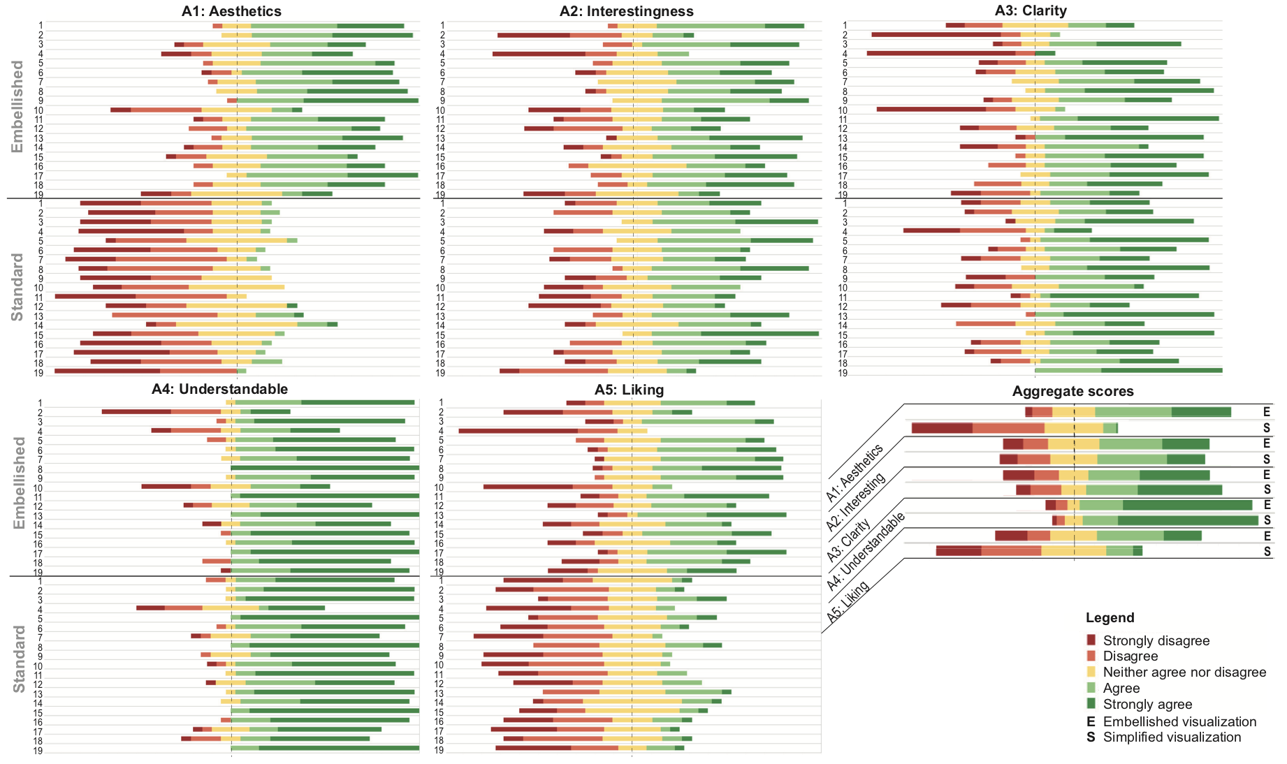
The charts below show how subjects scored the decorated vs minimalistic infographics along aesthetics, interestingness, clarity, understandability, and liking. While the minimalistic images score a bit better on clarity, all other scores show that the decorated charts are seen as better. This is a strong result, since the net effect of an infographic is a sum of several factors among which clarity is only one.
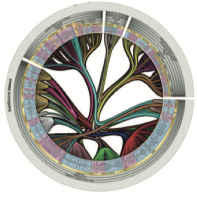
Eye gaze
We next collected the trails from eye-tracking of the subjects while watching the two kinds of infographics. The result is a complex, cluttered, image. We simplified this image by trail bundling, also using colors and texture to convey information on the trails' directions, density, and time dynamics. The image below shows the process. Compare snapshot (b), the raw trails, with snapshots (c-g) which show the simmplified, data-annotated, trails.
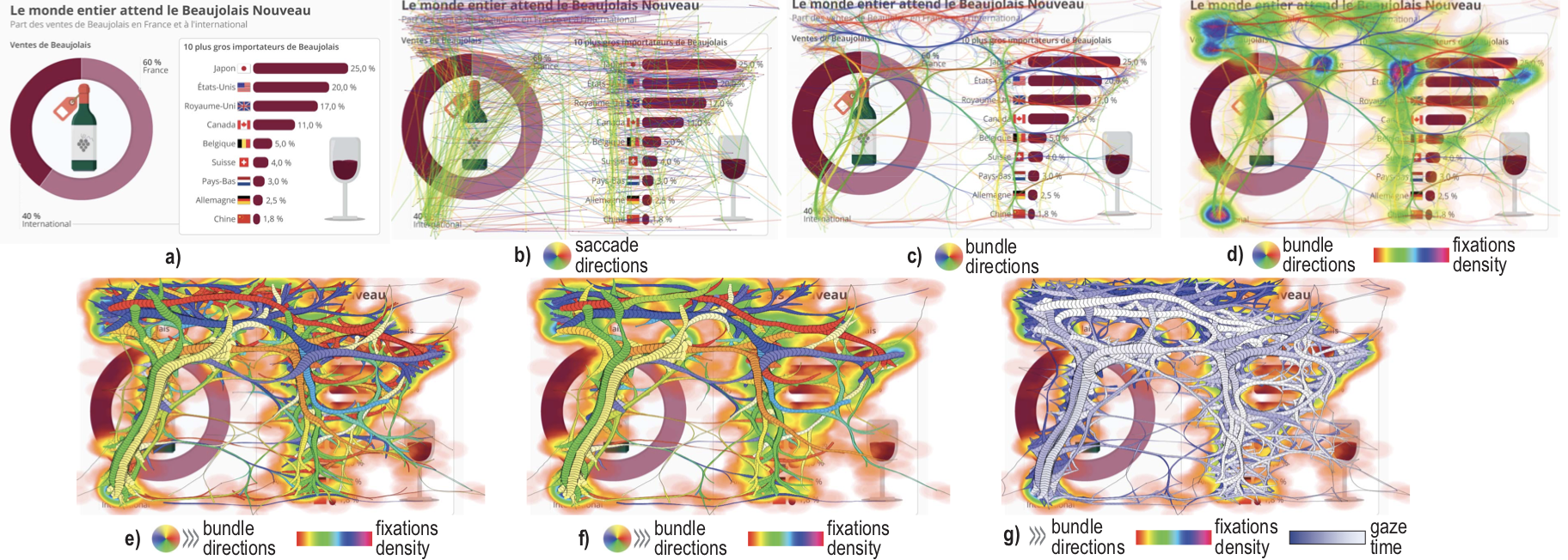
Analyzing the simplified trails let us find several common aspects of added-value of decorated infographics, as well as several design pitfalls which should be avoided when creating such imagery.
Video
Watch below the summary of our work.
Learned lessons
Several important conclusions follow from this study:
- decorated infographics are not necessarily worse than minimalistic ones
- decoration does help in engaging users to interpret the message behind the chart
- certain design patterns are beneficial in infographics, and others are to be avoided
More information
For full details on the study and its recommendations:
Interpreting the Effect of Embellishment on Chart Visualizations T. Andry, C. Hurter, F. Lambotte, P. Fastrez, A. Telea. Proc. ACM CHI, 2021
Datasets All datasets obtained from our study