Attribute-based Visual Explanation of Multidimensional Projections
Problem
Dimensionality reduction methods, or projections, are one of the most-used techniques to reduce high-dimensional (nD) data to 2D scatterplots. They can effectively show how samples gather (or not) into groups, with possible outliers. Coloring samples by class next serves to see how easy it would be to use the underlying dimensions (features) for data classification.
Still, a raw projection is nothing but a 2D scatterplot. We can see in there how clusters form. But which dimensions (features) are responsible for the clusters' formation? Without knowing this, a projection is not very useful.
Solution
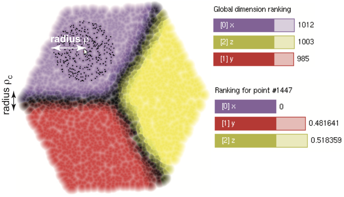
We propose a technique for explaining a 2D projection by means of the dimensions which are most relevant for point segregation. Our technique works as follows. Given an nD dataset, we
- project this into 2D using any desired technique
- for each projected point, select its nearest neighbors
- rank the n dimensions of points within such a 2D neighborhood, to see which ones best explain the 2D similarities
- color the point by the identity of the best-explaining nD dimension, and set its brightness to how much of the similarity is explained by that dimension
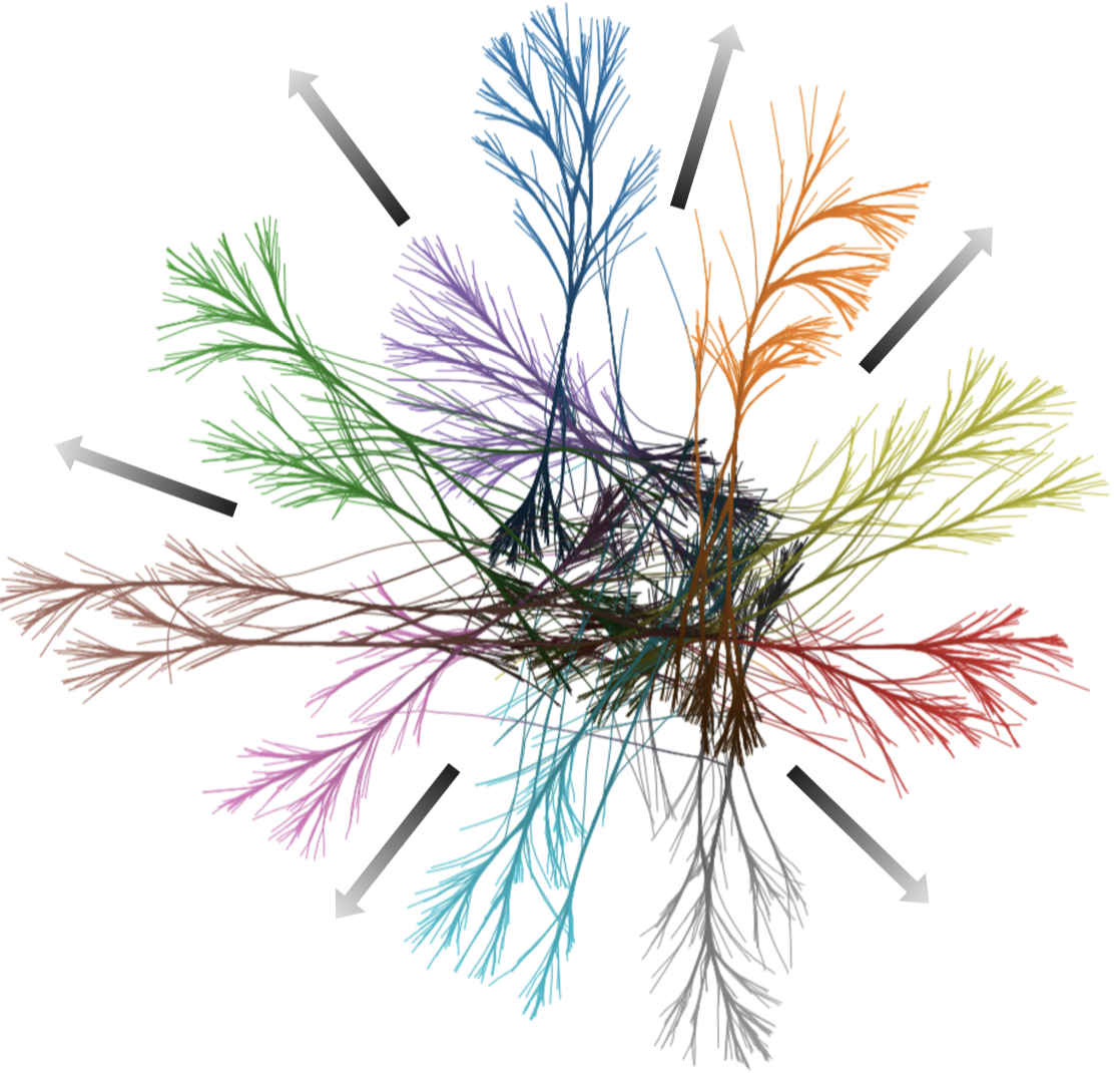
The image below shows this for a simple 3D cube-surface dataset. Here, clearly, the visible cube faces are explained each by a single dimension. This is visible in the per-face colors. Points close to a cube edge are dark(er) since their similarity is explained by two or, for cube corners, three dimensions.
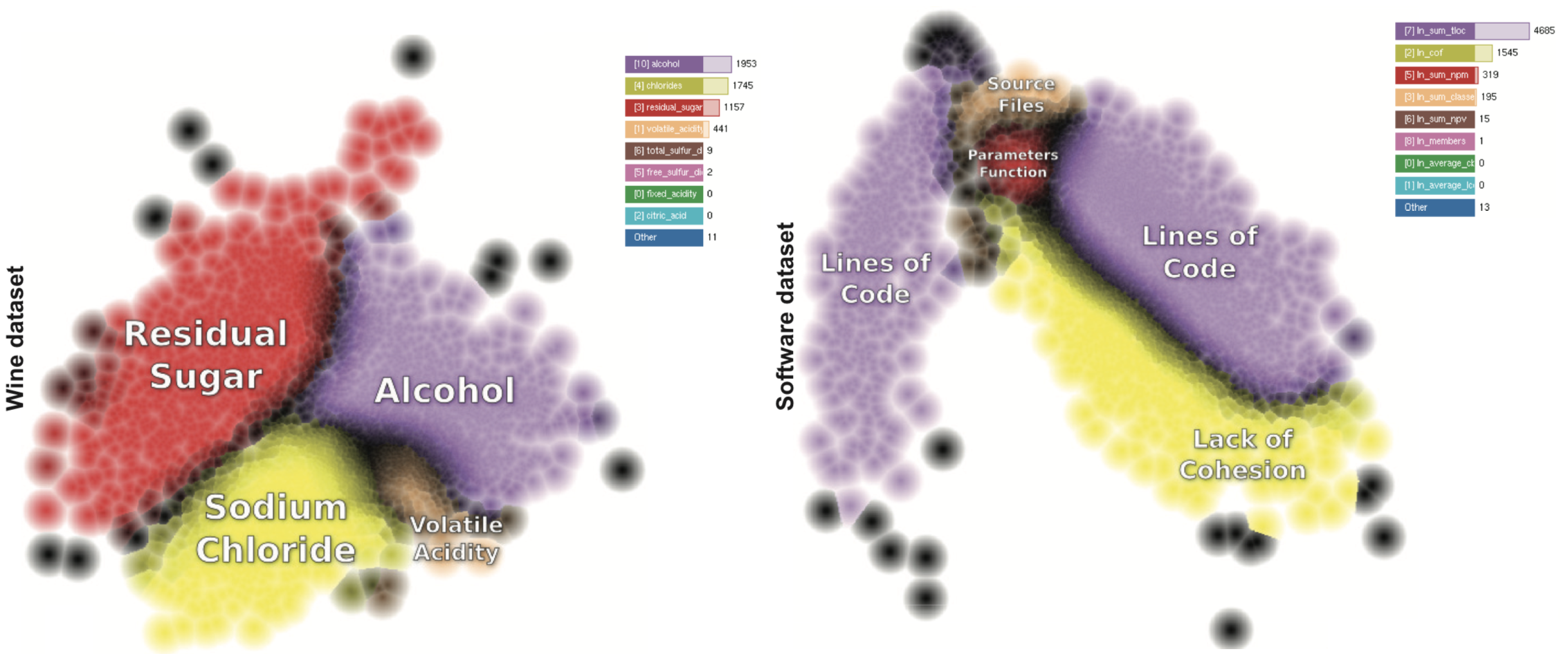
The image below shows this for two datasets (left: wines, attributed by 15 physiophysical metrics; right: software projects, attributed by 20 quality metrics). Colors show in each case the identity of the main dimension which makes points similar to each other. Brightness shows how, as we move in the data space, the dominant explaining dimension becomes less important and another dimension takes over.
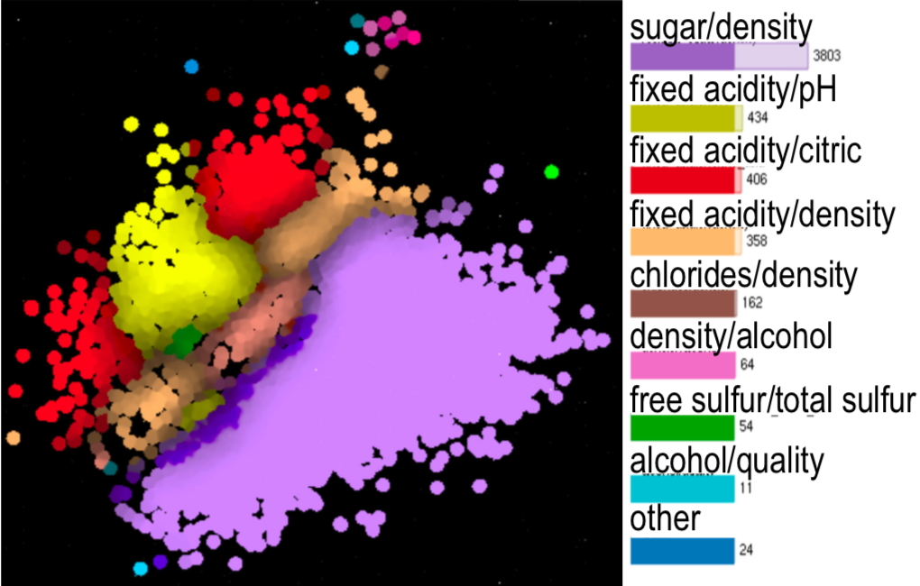
Besides the above, we also explain a projection by showing which dimensions are strongest correlated over specific areas thereof. The image below shows this for the wine dataset. We can see how the regions explained by the similarity of a single dimension (image above) are complemented by showing which dimensions are correlated.
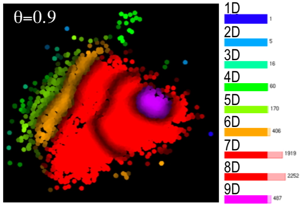
A third explanation shows the intrinsic dimensionality of data in a projection. Regions with high dimensionality require many dimensions to be understood; regions with low dimensionality require only few such dimensions, which can be provided by the two explanations presented above. The image below shows this for the wine dataset. We see how the intrinsic dimensionality increases gradually from the left to the right of the projection.
Features
Our technique is
- generic: works for any nD dataset, any dimensionality-reduction method
- robust: it has parameters to control the amount of noise generated
- simple to implement
Publications
Attribute-based Visual Explanation of Multidimensional Projections R. da Silva, P. Rauber, R. Martins, R. Minghim, A. Telea. Proc. EuroVA, 2015
Metric Evolution Maps: Multidimensional Attribute-driven Exploration of Software Repositories R. da Silva, E. Vernier, P. Rauber, J. Comba, R. Minghim, A. Telea. Proc. VMV 2016, Eurographics
Enhanced Attribute-Based Explanations of Multidimensional D. van Driel, X. Zhai, Z. Tian, A. Telea. Proc. EuroVA, 2020