Visual Analysis of Dimensionality Reduction Quality
Problem
Dimensionality reduction (DR) is a decades-old method for cutting down the number of dimensions (variables) of data points so that inter-point distances or similarities stay roughly the same. This way, even very high (say hundreds or more) dimensional datasets can be reduced to ultimately two-dimensional ones, which allows visualizing them as, for instance, scatterplots.
Tens of different DR algorithms exist (see this survey). For anything but trivial datasets, none of them can perfectly preserve the high-dimensional distances into the low-dimensional space. So, how to see where, and how much, a DR method creates errors?
Visualizing errors
Typical DR error metrics yield a single value for an entire projection. This is too coarse, since large variations can exist over its samples. To address this, we propose to measure and visualize several types of local errors, as follows.
Aggregate error
For each sample, we measure the (normalized) difference between the distance between that sample and all others in the dataset. We encode this using a multiscale scheme: Users can tune the scale parameter to highlight local variations, or conversely, show only more global patterns. The image below shows this, at three scale levels (fine to coarse, left to right). Red hot-spots indicate projection points having high aggregate errors. As visible, this projection is overall good, since there are only a few hot-spot islands.
False neighbors
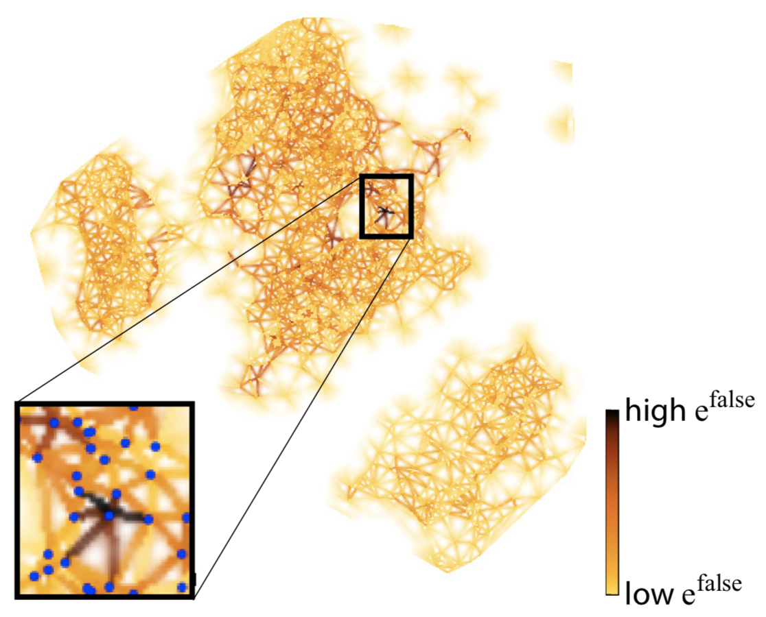
We refine the aggregate error to be more specific: We define false neighbors to be samples placed too close in 2D as opposed to the high-dimensional space. We show this metric by doing a Delaunay triangulation of the 2D projection scatterplot, computing the distance-mismatch error for the triangle-fan vertices around each 2D point, and color-coding the respective fan edges. The image below shows this for the same projection as above. Dark Delaunay edges show points having (many) false neighbors. As visible, there are only a few such points in this projection.
Missing neighbors
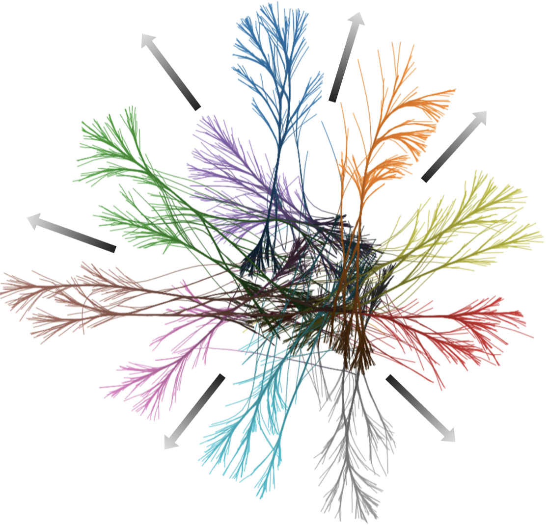
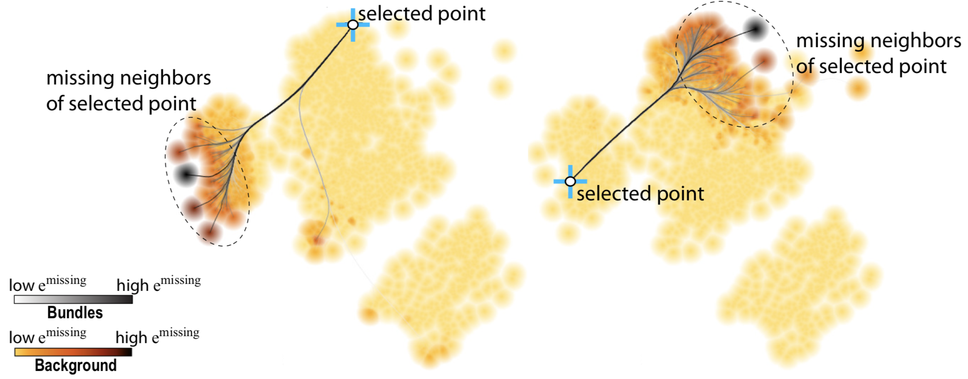
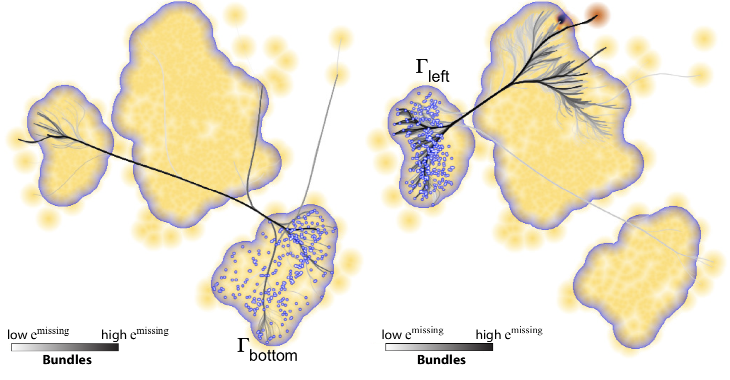
These are the complement of false neighbors, i.e., points which are close to a sample in the high-dimensional data, but placed too far in the 2D projection. Unlike false neighbors, we cannot (easily) visualize all false neighbors in a projection, since, for each point, these may be scattered anywhere in the 2D space. Hence, we let the user to select a projection point, then find its false neighbors in the projection, link them with lines to the point, and finally bundle these lines (using CUBu), to reduce clutter. The image below shows this for two points. We see how the left part of the projection has missing neighbors placed in its right part, and conversely.
Generalizing to point groups
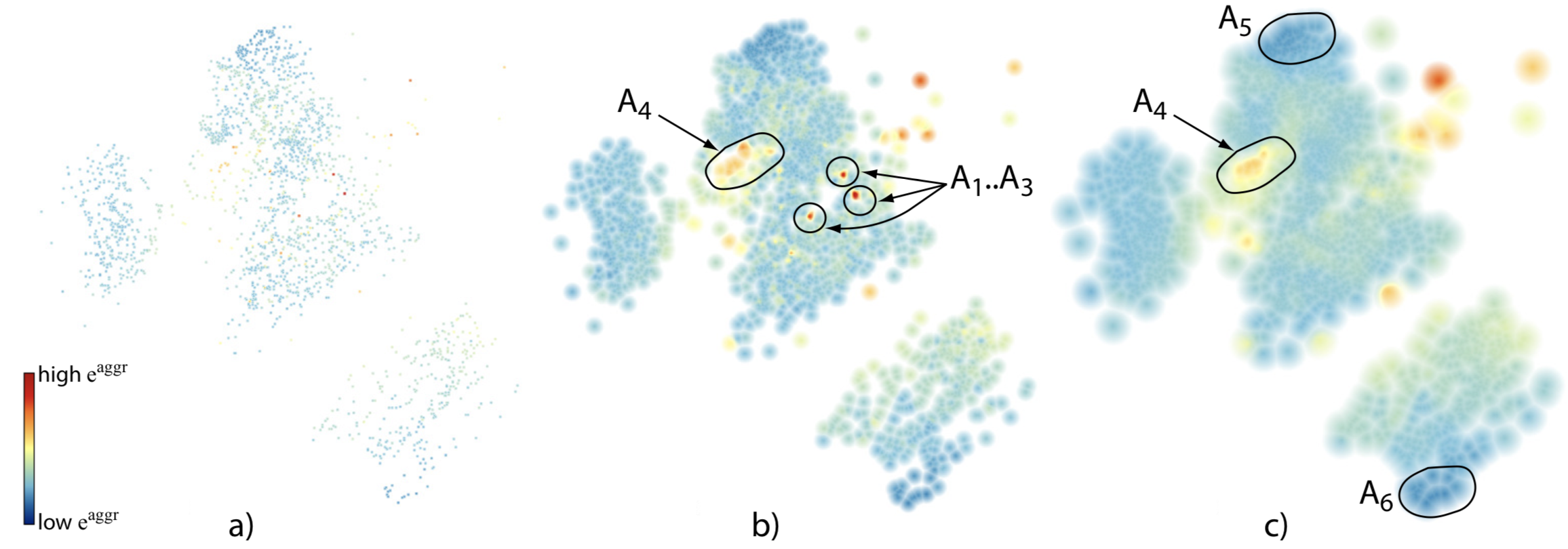
Computing and showing missing neighbors for each individual projection point is cumbersome. Users typically reason about point groups in a projection. Hence, we generalize the missing neighbors metric to an entire group of close projection points: The user can select such a group, upon which we show the missing neighbors of all group points. This way, one sees what the points the group misses in the projection. The image below shows this for two groups.
Evaluation
We used our above visualizations to assess the quality of several well-known projection techniques (LSP, ISOMAP, LAMP, PLMP, Pekalska) on several real-world datasets. This way, we discovered several subtle differences of the analyzed algorithms.
Scalability
Our method is highly scalable since we work in image space: All visualizations use every screen pixel to encode (error) information, thereby easily handling very dense projections. Moreover, the image-based approach is efficiently implemented on the GPU (NVidia CUDA) allowing the treatment of projections of up to a million points in real time on a modern desktop PC.
Publications
Visual Analysis of Dimensionality Reduction Quality for Parameterized Projections R. Martins, D. Coimbra, R. Minghim, A. Telea. Computers and Graphics, vol. 41, pp. 26-42, 2014
Implementation
Our local quality metrics, and interactive visualization thereof, are implemented in a tool called ProjExpplain using C++, OpenGL, and NVidia CUDA. Openly available here.